project opal
← All work

Batch & Bloom / Case study

A bakery identity.
Made to be recognised.

Brand design for an artisan bakery, bringing a distinctive red mark, warm colours and clear typography to signage, packaging and everyday print.

Brand identity Logo design Packaging design Signage Brand guidelines

Sector

Food & hospitality

Project

Bakery brand identity

Focus

Identity & applications

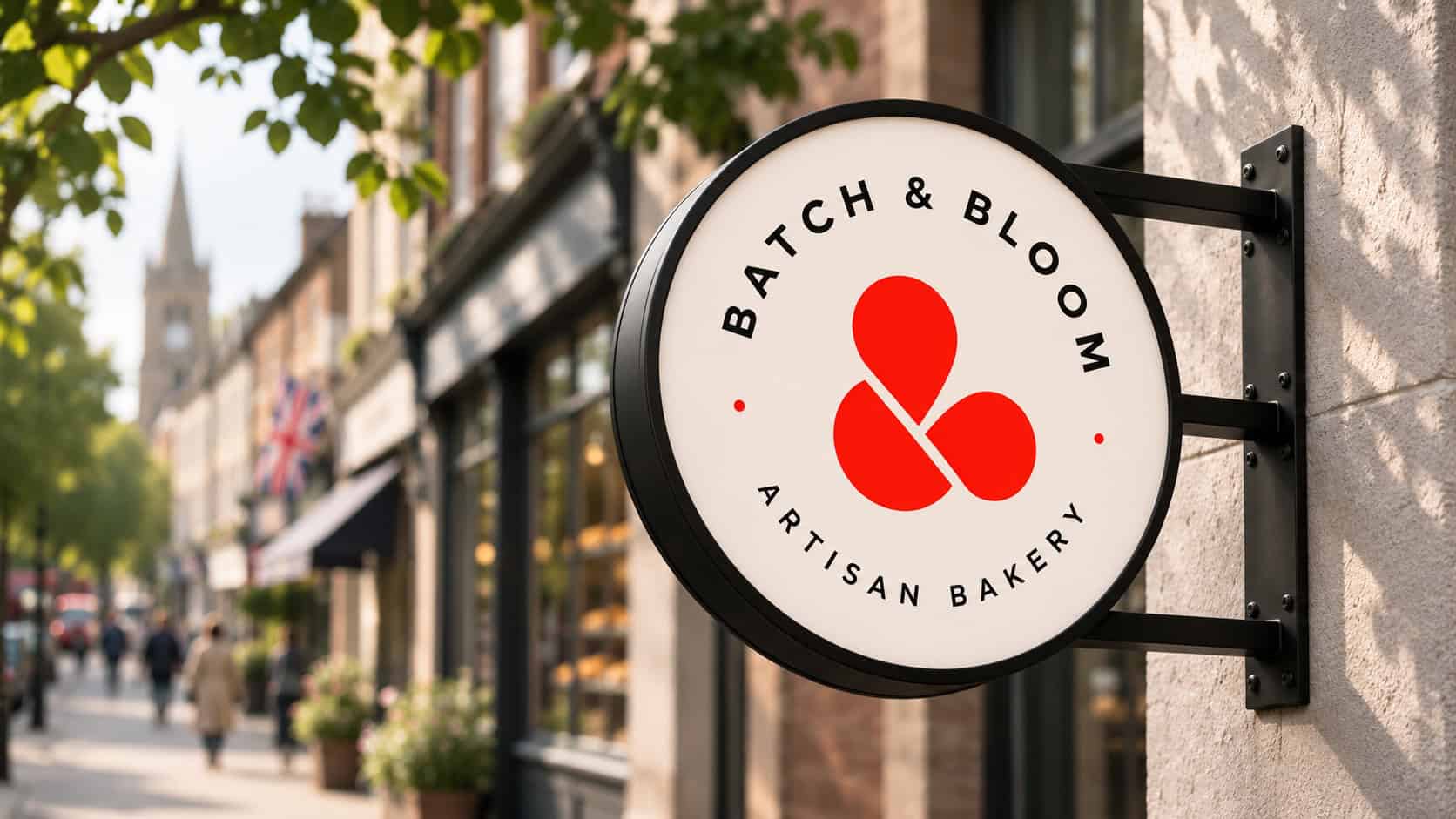
Batch and Bloom circular artisan bakery sign with the red brand mark
The circular shop sign mockup brings the Batch & Bloom name and red brand mark together.

The project at a glance

A distinctive mark.

A simple red symbol that works with the full bakery name or on its own.

A warm visual language.

Bakery red, warm cream and ink black, paired with bold, straightforward typography.

An identity in use.

A shared approach across the shop sign, takeaway bag, product card and street poster.

The brief

Bring the bakery’s character
into the everyday.

The design challenge was to give Batch & Bloom a recognisable identity that feels at home in an artisan bakery.

It needed enough presence for a shopfront, and enough simplicity for the smaller things customers encounter at the counter.

The work brings the logo, colours, typography and messaging into one system, then explores how those elements adapt to signage, packaging and print.

What needed to work

Make the mark memorable

Create a distinctive symbol that remains recognisable with the name, in a circular sign or used on its own.

Keep the information clear

Give product names, prices and short messages enough space and contrast to be understood quickly.

Make the applications feel connected

Use the same design elements across large and small formats, without making every layout identical.

What we delivered

Simple ingredients.
A recognisable whole.

01 / Visual identity

A mark with character.
A system with clarity.

The red brand mark gives the identity its focal point. It can sit above the bakery name, stand alone or work inside the circular sign lockup.

Warm cream softens the palette, while ink black keeps names and practical information clear.

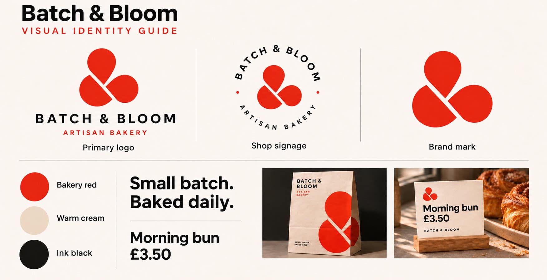
The visual identity guide brings those elements together: logo variations, colour, typography and application examples. It sets out a consistent direction without relying on one fixed layout.

Logo system · Colour palette · Typography

Batch and Bloom visual identity guide with logos, colour palette and applications
The visual identity guide: primary logo, signage lockup, brand mark, colours and supporting applications.

02 / Packaging

Take the brand
beyond the counter.

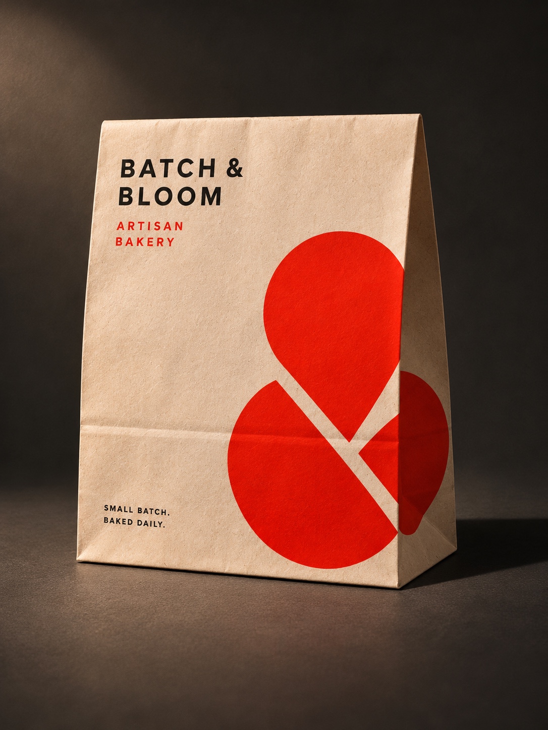
The takeaway bag uses the mark at a larger scale, turning it into a graphic element as well as a logo.

The bakery name and short “Small batch. Baked daily.” message stay clear, while the warm paper tone sits naturally with the wider palette.

Takeaway packaging · Graphic application · Brand messaging

Batch and Bloom kraft takeaway bag mockup with an oversized red brand mark
The kraft bag mockup uses an oversized red mark alongside clear bakery naming and messaging.

03 / Signage & print

Small details.
The same identity.

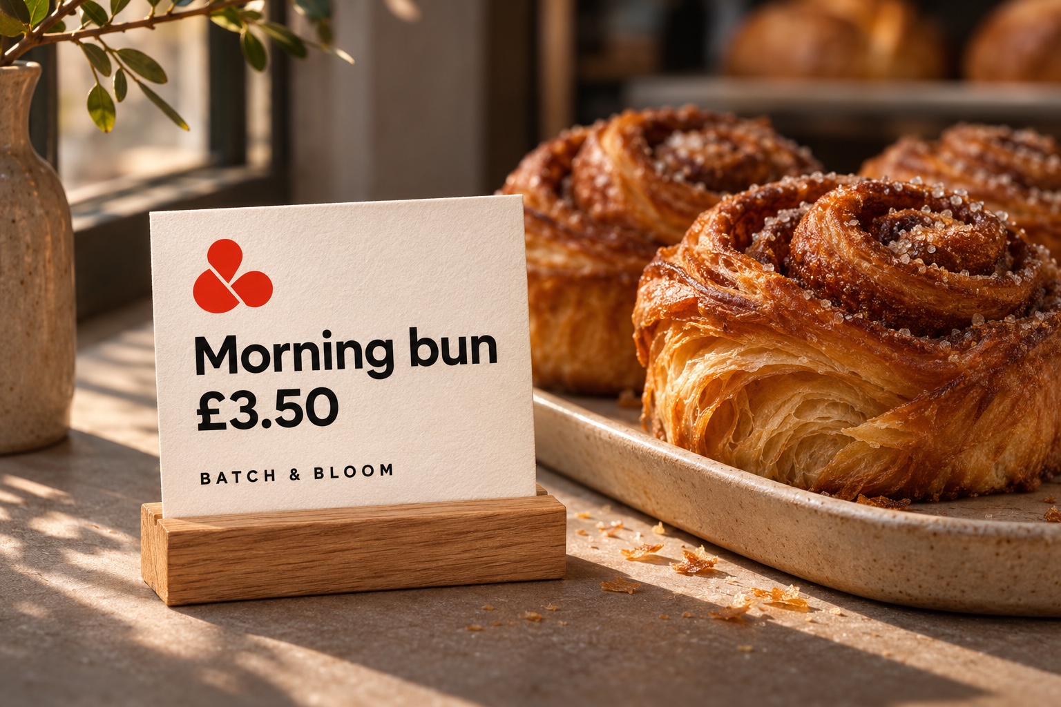
On the product card, the design gives the product name and price priority, with the red mark and bakery name providing the brand connection.

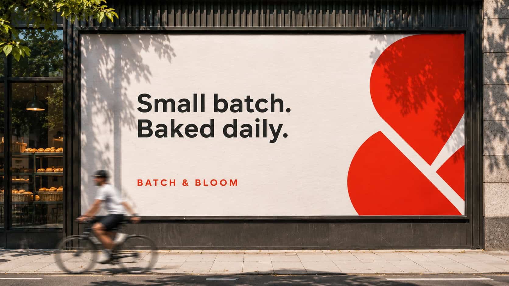
The same approach scales up to the street poster: a short message, generous space and a large crop of the mark. Each application has a different job, but shares the same visual language.

Product cards · Shop signage · Poster design

Batch and Bloom morning bun product and price card mockup
The product card mockup keeps the name and price easy to read, supported by the brand mark and bakery name.
Batch and Bloom street poster mockup reading Small batch. Baked daily.
The street poster mockup scales up the same mark and short message, giving the identity room to stand out.

The design outcome

A consistent identity.
From street to counter.

The work establishes a clear set of visual elements and shows how they can adapt across the bakery’s customer touchpoints.

The result is a connected design system, demonstrated through signage, packaging, product cards and a street poster.

Area

The design task

What the project delivered

Identity

The design task

Give the bakery a distinctive, recognisable visual identity.

What the project delivered

A red brand mark, primary logo and circular lockup, supported by a warm three-colour palette.

Everyday applications

The design task

Carry the identity across different formats while keeping information clear.

What the project delivered

Packaging, shop signage and product card mockups that share the same mark, colours and typography.

Brand consistency

The design task

Bring the design decisions together in a usable reference.

What the project delivered

A visual identity guide showing logo variations, the palette, type treatment and application examples.

START A PROJECT

What would you like to build, improve or Fix?

Whether you have a clear brief or just the start of an idea, we'll help you shape the right next step.
Design, development and marketing for businesses that want to do more.
project opal
We help businesses build stronger brands, make better use of technology and get more from their marketing.
top software developers for manufacturing in manchester
Techies Go Green
GET IN TOUCH
©2026— Project Opal Ltd
Cookie Policy Privacy Policy