project opal
← All work

Carpenter / Case study

Making complex products
easier to understand.

3D product visualisation for Carpenter, turning photographic references into clear, consistent mattress illustrations for marketing and presentation materials.

3D modelling Product visualisation Rendering Marketing assets Visual consistency

Sector

Manufacturing & materials

Focus

Product communication

Deliverables

Exploded-view illustrations

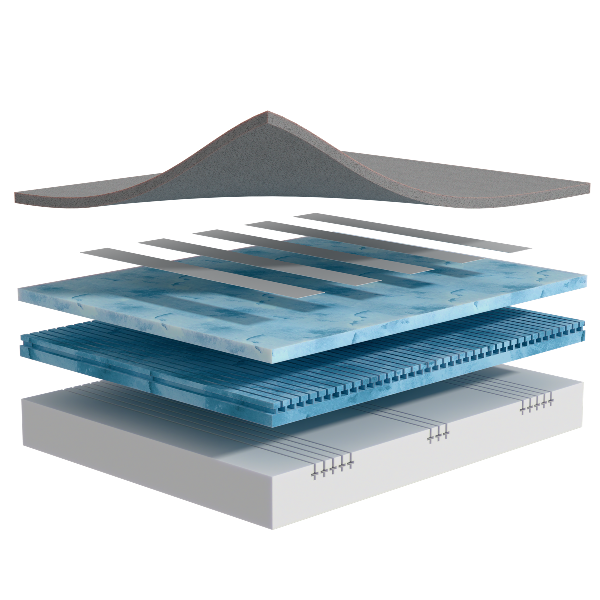
Carpenter exploded-view product illustration
A finished product illustration, using an exploded view to make the relationship between elements visible.

The project at a glance

Show more than the exterior.

Exploded views separate the product into a clear visual arrangement, making its construction easier to see.

Keep the range consistent.

A shared approach to perspective, lighting and materials brings different products into one visual family.

Make the assets useful.

Standalone illustrations designed for use within brochures and trade presentations.

The brief

Explain the product.
Keep the presentation clear.

Carpenter needed product illustrations that could show more than an exterior photograph. The task was to represent the products clearly while giving the range a consistent visual style.

We worked from client-supplied reference photographs to create stylised 3D illustrations. The focus was on making the products easier to present and discuss, without overloading the image with labels or distracting detail.

What needed to work

Represent the product faithfully

Use the supplied reference material to guide the shapes, surfaces and overall presentation.

Make the elements distinct

Create enough visual separation to show how the product elements relate to one another.

Bring the range together

Use a consistent visual approach so different products work together as a set.

What we delivered

Clear product visuals.
A consistent approach.

01 / Visual direction

Start with one.
Get the approach right.

We developed an initial product illustration for review before applying the agreed approach across the wider set.

That established the perspective, lighting and level of detail, giving the project a consistent starting point.

The aim was a clear, stylised representation that remained faithful to the product while working as a marketing image in its own right.

Reference interpretation · Visual direction · Client review

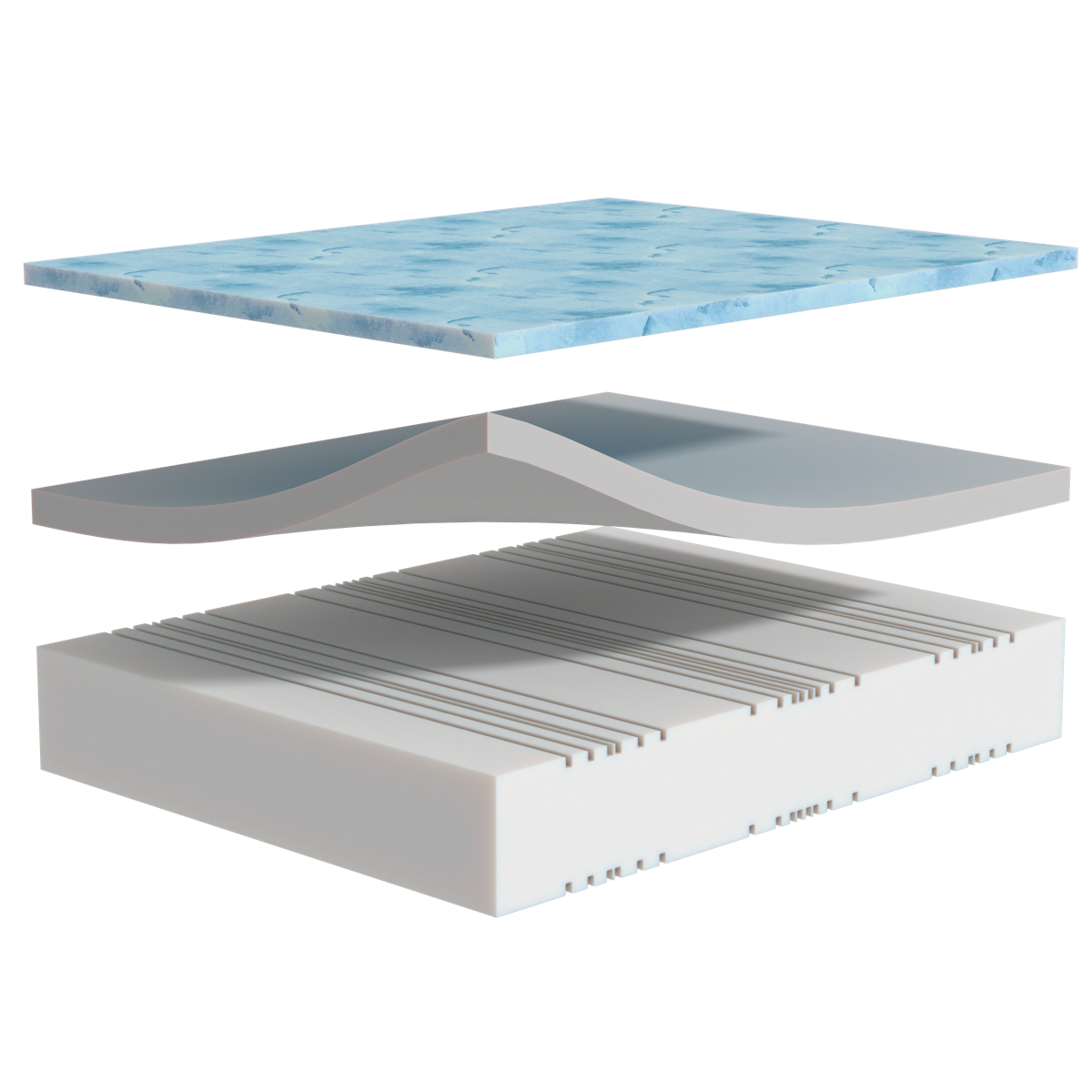
Carpenter product illustration with separated elements and consistent perspective
A finished illustration from the set, showing the agreed approach to perspective, materials and visual separation.

02 / Modelling & rendering

Separate the elements.
Connect the story.

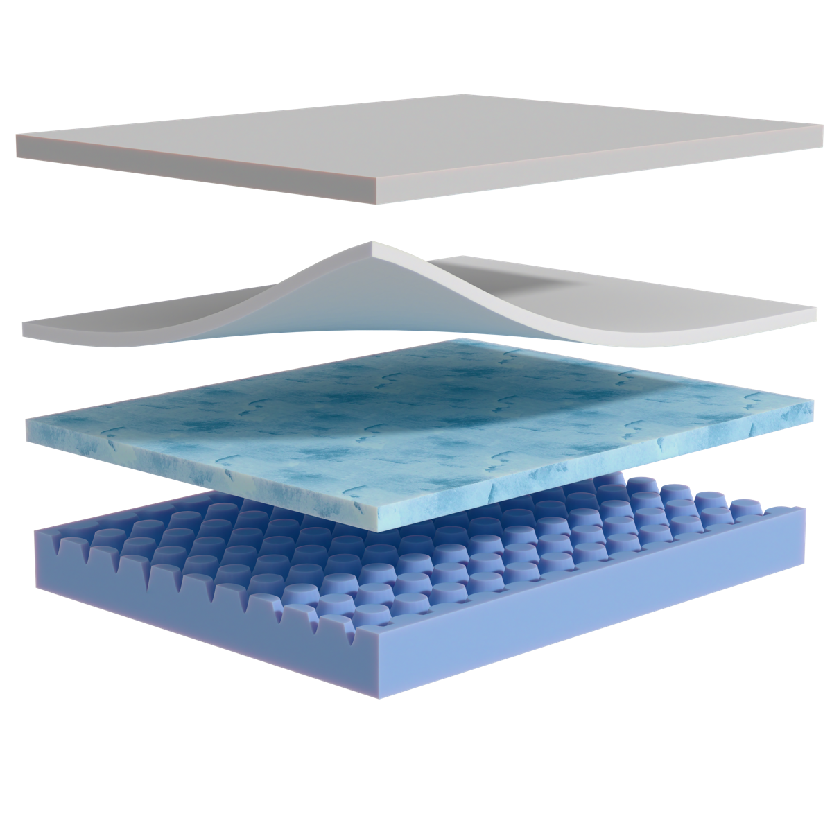
The exploded-view format creates space between the product elements while keeping their relationship clear.

Colour, texture and controlled lighting help distinguish the surfaces and shapes without relying on extensive annotation.

3D modelling · Materials · Rendering

Carpenter product render showing distinct shapes and materials
The same rendering approach applied to another product, keeping the individual elements clear within the overall illustration.

03 / A consistent range

Different products.
One visual language.

The same rendering approach carries across the illustrations, so the range feels connected when presented together.

The finished images were prepared as standalone marketing assets for use in brochure and trade presentation layouts.

Range consistency · Standalone assets · Marketing presentation

The process / Product visualisation

Review the reference.
Establish the style.
Build a consistent set.

01 / Understand
Interpret the supplied photographs and agree the visual direction.
02 / Create
Model the products and refine the perspective, lighting and materials.
03 / Deliver
Prepare the finished illustrations as standalone marketing assets.
A shared process keeps the visual approach consistent from the first reference review to the finished assets.

What the work delivered

A clearer way
to show the product.

The project produced a consistent set of 3D product illustrations, making internal construction visible in a way an exterior photograph cannot.

It gave Carpenter a shared visual approach for presenting the range across its marketing materials.

Area

The design task

What the project delivered

Product explanation

The design task

Show more than the exterior of the product.

What the project delivered

Exploded-view illustrations that reveal the relationship between the product elements.

Visual consistency

The design task

Make different products feel connected as a range.

What the project delivered

A consistent approach to perspective, materials, lighting and presentation.

Marketing assets

The design task

Provide finished visuals that work within marketing layouts.

What the project delivered

Standalone renders prepared for brochure and trade presentation use.

START A PROJECT

What would you like to build, improve or Fix?

Whether you have a clear brief or just the start of an idea, we'll help you shape the right next step.
Design, development and marketing for businesses that want to do more.
project opal
We help businesses build stronger brands, make better use of technology and get more from their marketing.
top software developers for manufacturing in manchester
Techies Go Green
GET IN TOUCH
©2026— Project Opal Ltd
Cookie Policy Privacy Policy