
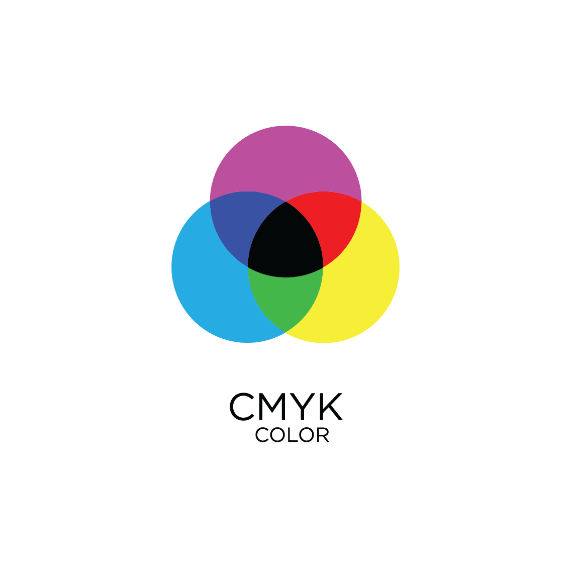
CMYK or RGB?
What are they and why do I need to know about them?
Whether you're a graphic designer or just looking to do some printing/social media posting, your colour mode will determine how good your final product actually looks.
But what is a colour mode?
The colour mode is another option for the setup of your work, much like the size of your page or the orientation for example. Choosing the correct colour mode from the beginning will help you select the appropriate hues for your media. This is important as it will effect the output of your work as you may not achieve the desired finish otherwise.
What are CMYK and RGB colour modes used for?
The main difference between the two is that CMYK is used for physically printed media, whereas, RGB is for digitally produced media.
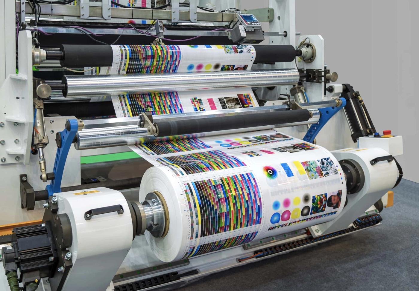
CMYK
Leaflets
Posters
Business Cards
T-Shirts
Packaging
RGB
Elements for websites
Online Advertisements
Social Media Images
GIF’s
Online Infographics
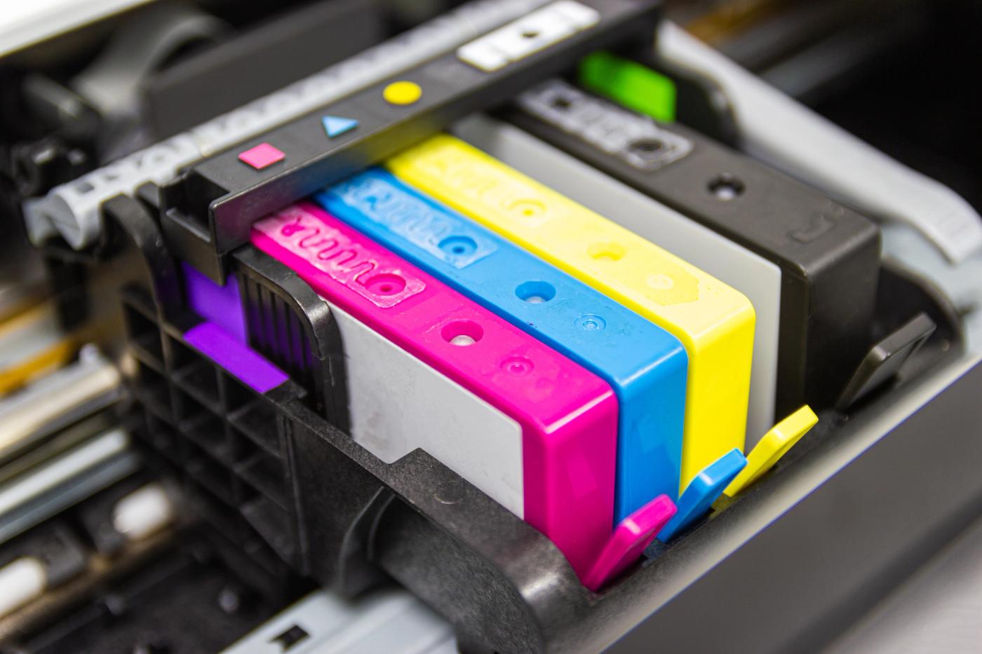
What is CMYK?
Cyan, Magenta, Yellow and Key (Black). CMYK printing is a subtractive printing process which mixes and layers pigments to produce colours.
Similar to a painting where layers are built up allowing certain colours to be visible. Usually, when C, M and Y overlap one another at the same time, they create Black. However, the toners in the printer cartridges aren’t opaque enough to create Black when C,M and Y are mixed which is why an additional black cartridge is included. Black is referred to as Key (K) because Lithographic printing methods use metal plates. The most detail would be kept on the Key plate which was usually printed in Black.
CMYK colour blends
Lithographic Printing
What is RGB?
Red, Green and Blue. RGB is a additive colour blending process used for monitors and screens. Images on screens are made up of pixels which each contain 3 sub pixels, either Red Green or Blue. When mixed together, an array of colours can be generated. Screens and monitors shine Red, Green and Blue bulbs at different intensities to generate the pixels. When Red, Green and Blue shine at max intensity together, they create White. On the opposite end of the scale, when none of the bulbs shine together, they create Black. The numerical value for the minimum intensity is 0 and the maximum is 255. You may see those values when choosing colour options either in Photoshop or when coding for example.
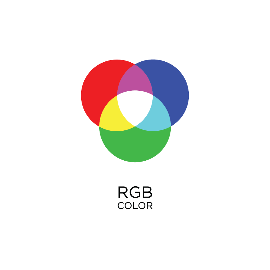
RGB colour blends
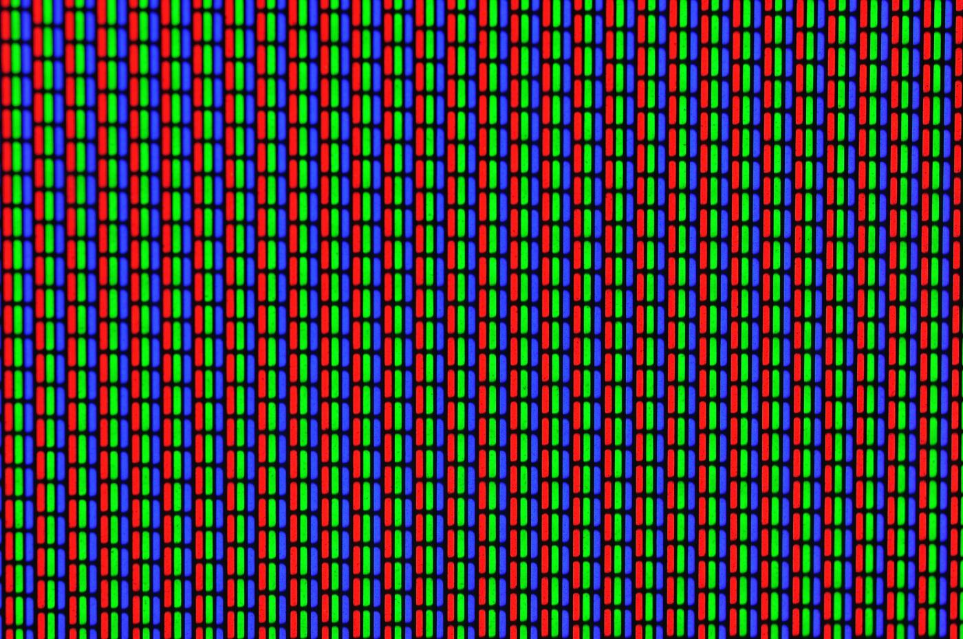
RGB Bulbs
How do I know what colour mode I am in?
Ideally you want to set your colour mode before you start your project but if you haven't, that’s ok. Chances are, you'll be working in the most common of Adobe programmes such as Photoshop, Illustrator or InDesign. But sometimes you will be working in another programme and when in doubt, searching google for where to find the colour mode option is helpful. Below, I have included example of where to find the colour modes in Photoshop, Illustrator and InDesign.
How to change your colour mode in:
Photoshop - go to, Image > Mode (Choose either, RGB color OR CMYK color)
Illustrator - go to, File > Document Color Mode (RGB color OR CMYK color)
InDesign - go to, Window > Color > You will see the colour mode within this
window which will change depending on your document set up.
For example, if you have chosen to work in a letter or web format.
The end result when printing
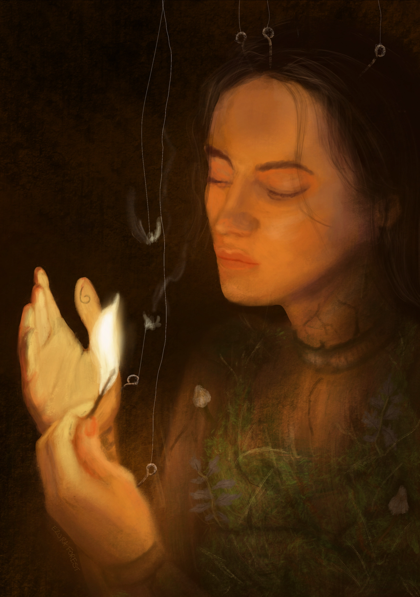
A common issue many of you may have come across is that exciting moment when you come to print off your work for the first time only for it too look dark and dingy or even have the wrong saturation.
Created in RGB
Printed in CMYK
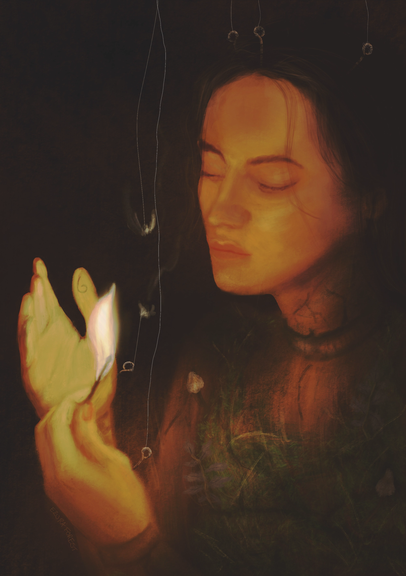
As you can see from the example of my work, I have originally created
this design in the colour mode RGB. Now although the print doesn't look
too bad, there is a noticeable change in the saturation. This is because I have
printed this portrait from a laser printer which uses CMYK toners. Its useful to
know which printer you are using as this also effects the output of your work.
The most common day to day printers are your desktop printers which will
either be Laserjet or Inkjet. The main difference between to two is how the
pigment is applied to the page.
But which printer should I use?
As for printing preferences, that’s completely up to you and which printer you
decide is the best for your work. Laser printers usually produce a sharper
and richer colour palette on paper. This is because they heat up and fuse
the powered toner onto the paper. Where as an Inkjet printer uses droplets
of colour released onto the paper and can therefore look a little washed out
and streaky in comparison to their laser printed counterparts.
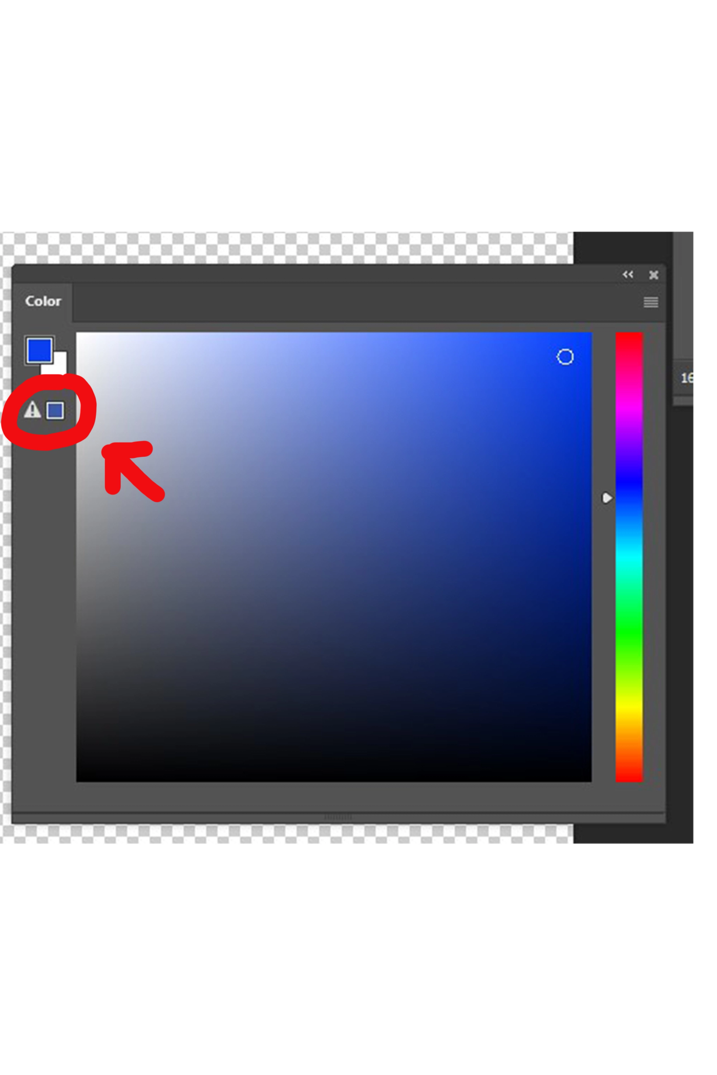
Have you ever noticed the little exclamation mark?
If you have worked in programmes such as Photoshop you may have seen see this icon appear when you are selecting colours. This means you are out of gamut, which is basically the available colour range. So for example if you try to choose a very bright red which looks amazing in your design on screen but this icon has appeared. You’re not going to be able to recreate that colour on the printed copy. If you are going to print your design, make sure all colours in your palette apply to the necessary gamut.
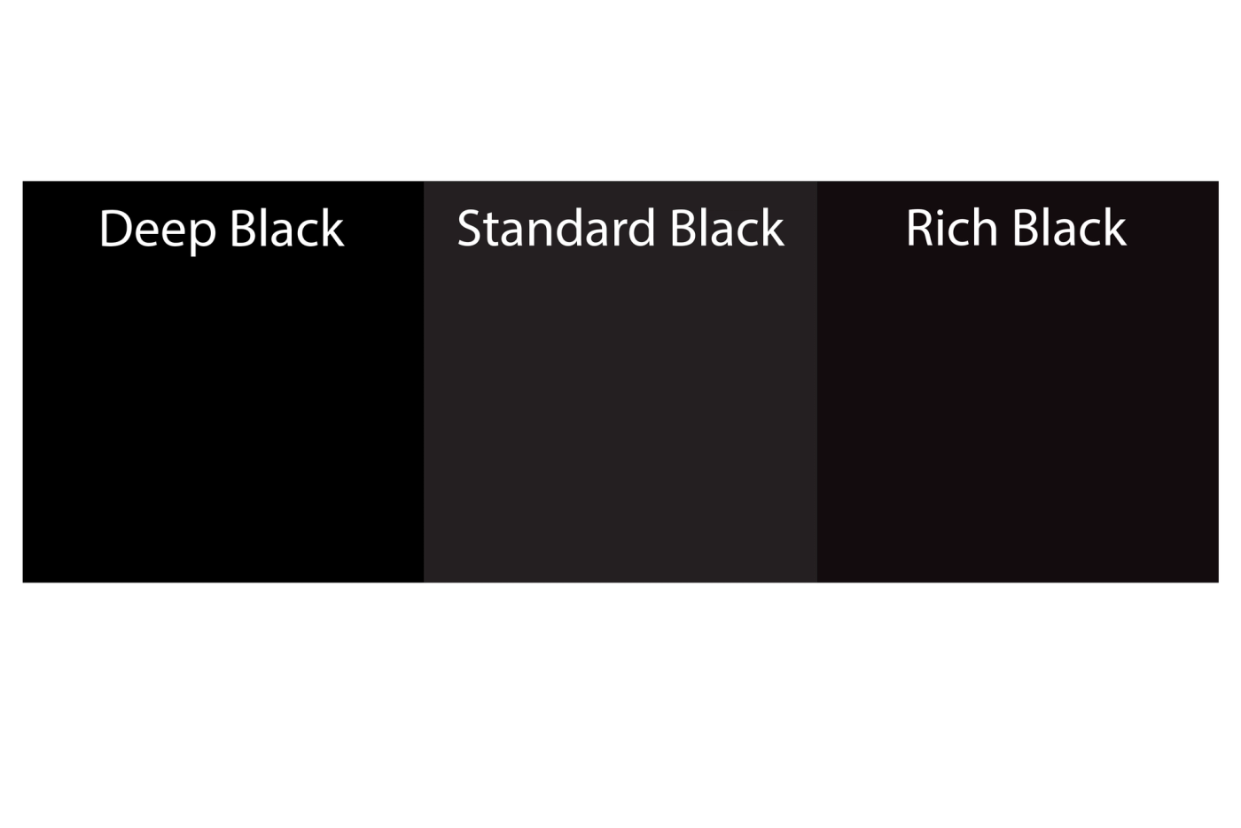
Black!
Continuing on the subject of printing colours, its important that you adjust the settings for your black too. Otherwise, you may find that when you have
printed your work, the black could be streaky, faded or even appear to have another hue mixed in.
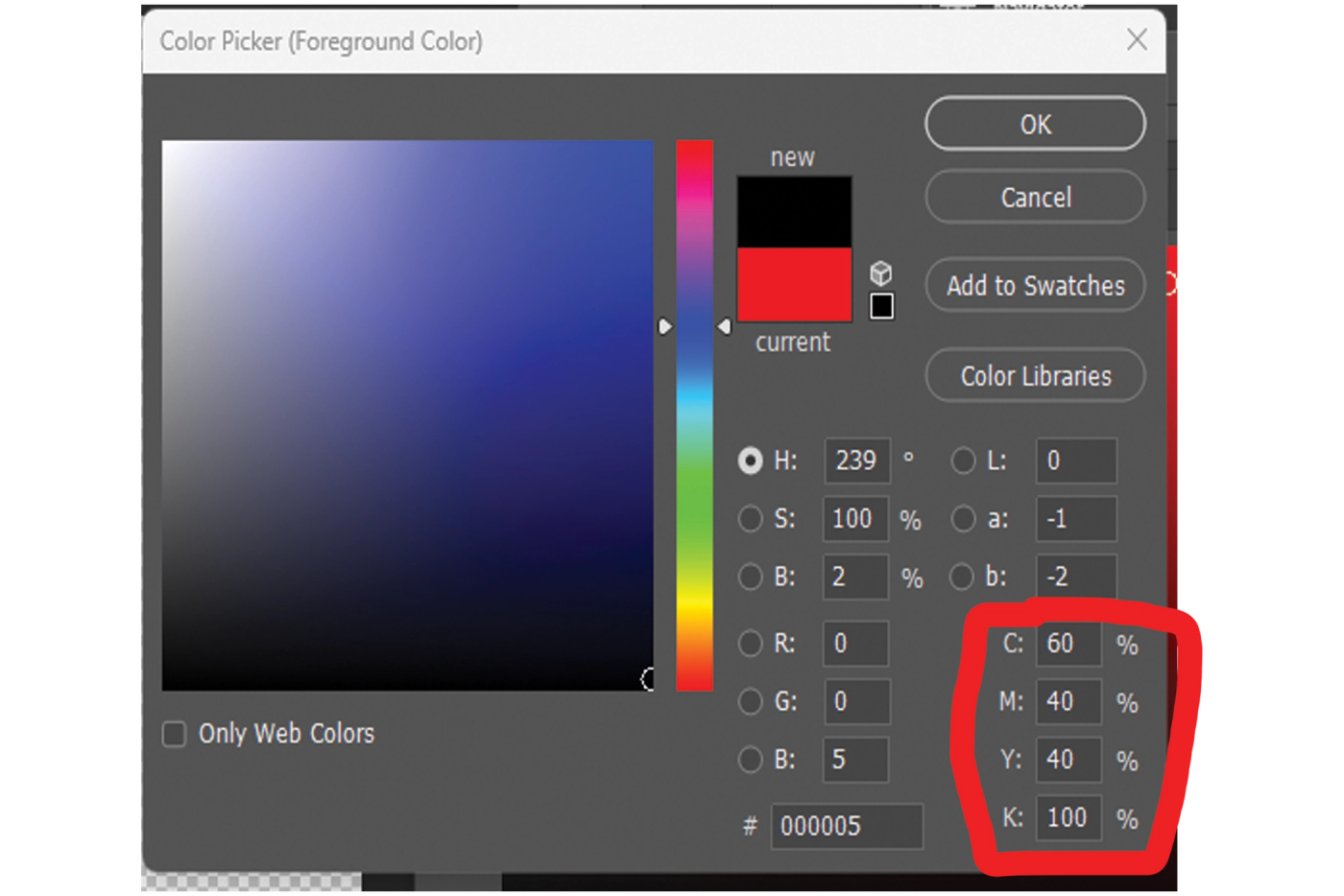
Deep Black
C: 60
M: 40
Y: 40
K: 100
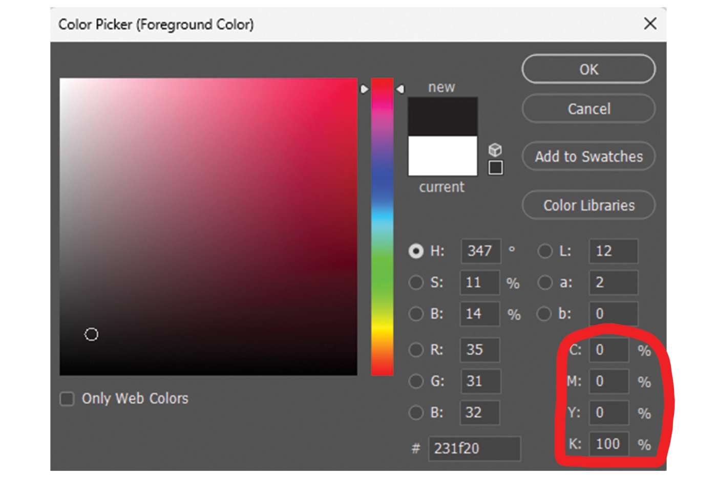
Standard Black
C: 0
M: 0
Y: 0
K: 100
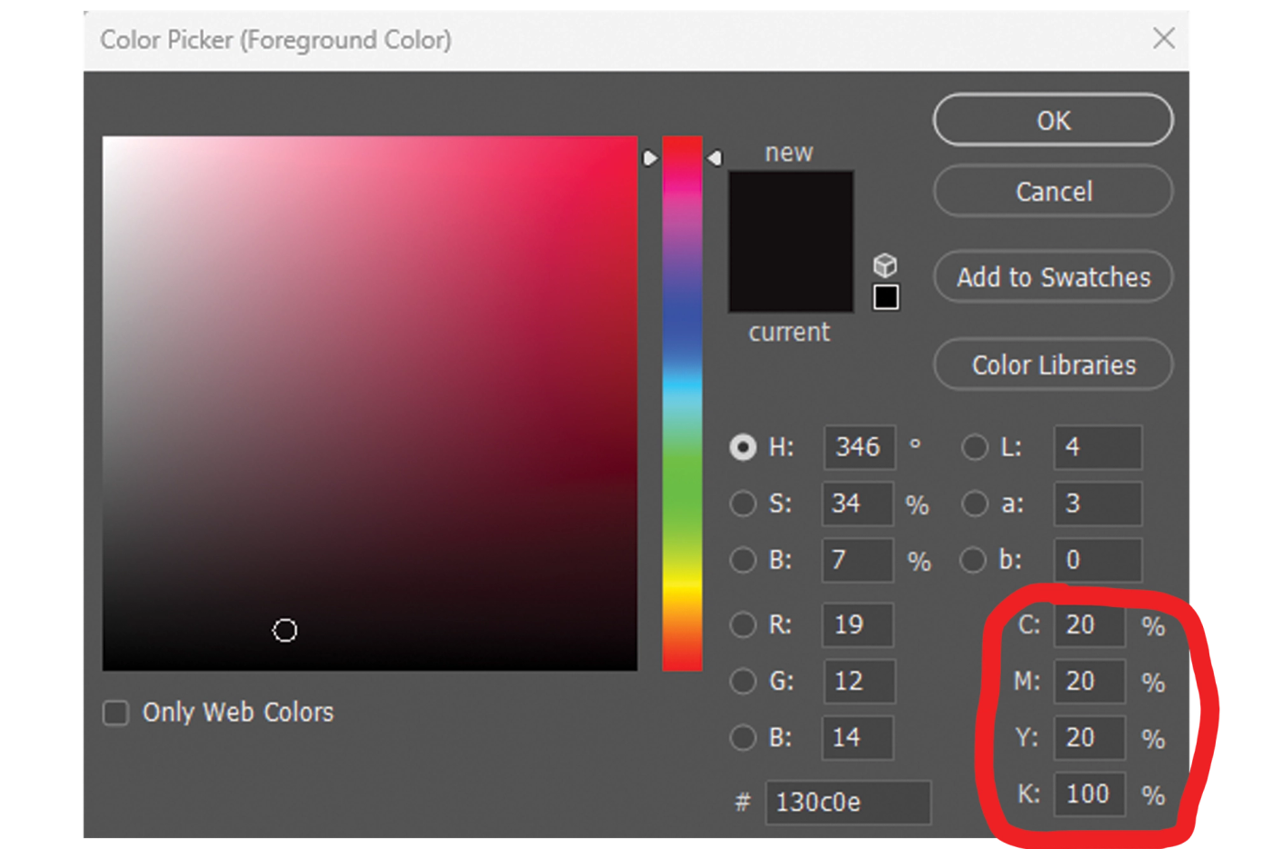
Rich Black
C: 20
M: 20
Y: 20
K: 100
Comparison
Working in RGB?
JPEG Used widely across web browsers and smartphones. It can display 16.8 million colours whilst staying at a small file size. Also allows for quick file transfers and viewing.
PNG Also used across websites but at a higher quality with a broader and brighter colour palette. Great for logo’s as you can save the file with a transparent background.
GIF A smaller file ideal for animations viewed in browsers or apps. It can only display a limited number of colours but are also perfect for logos with sharp lines or edges.
SVG Another web friendly format. SVG’s assign coding to the structures in the design so that they can be scaled without loss of quality for use on any sized screen.
Working in CMYK?
PDF Ideal for printing as this format can save Vectors and Bitmaps. PDF’s are generally compatible with most formats and will display the same across all devices.
TIFF Commonly used for high resolution photographs and can be blown up to large sizes for printed media. However, they have poor compatibility for online media.
EPS If you are sending vectors to a commercial printer, this is the ideal format to use. Commonly used for posters and billboards, PDF’s and AI files will also do the same job.
AI The native file type for Adobe Illustrator which is a vector design programme ideal for scaling images with no loss to their quality. Also perfect for posters a large print.
You’ve reached the end of the blog!
Now that you know how to set up your prints, you won’t have any trouble with creating amazing work. Your practically an expert now because you can determine the correct colour mode, you know difference between the colour modes and what they are for, plus, you’re able to balance you blacks and use the correct format for you output.
More articles from Project Opal.

How to Build a Social Media Strategy That Actually Drives Business Growth
In this blog, we’ll break down the essential steps to building a social media strategy that delivers measurable business growth.

How to Design Social Media Posts that Convert Followers into Customers
In this blog, we'll walk through a step-by-step guide to help you create compelling social media posts that not only engage your audience but also drive conversions.

Emerging Trends in Restaurant App Development
In the fast-evolving world of restaurant technology, staying ahead of the curve is crucial for success. Discover how groundbreaking trends are reshaping the restaurant app landscape.