01 / Design
A consistent identity across the business.
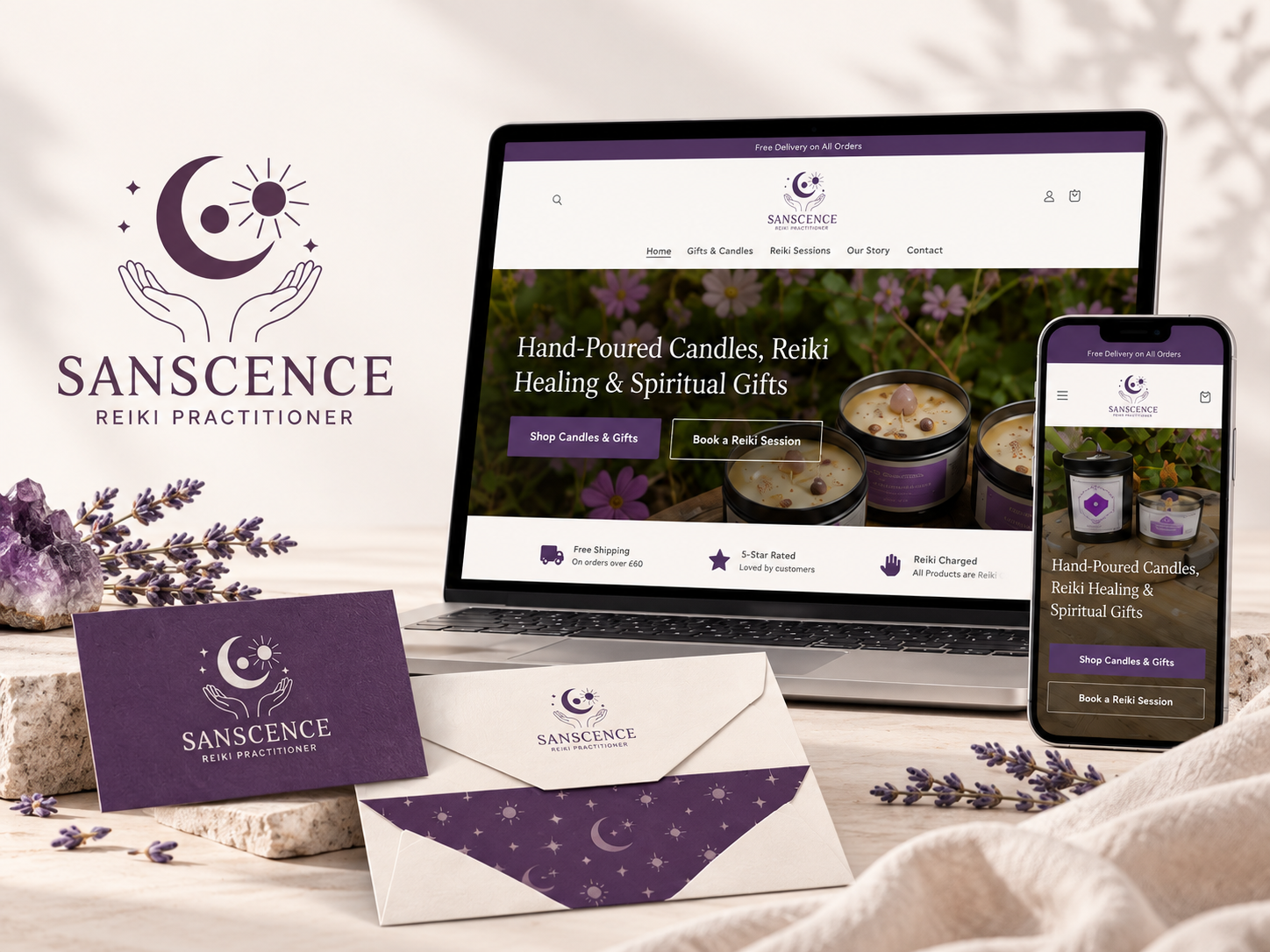
Sanscence needed an identity that worked just as well for its Reiki treatments as it did for its range of handmade products.
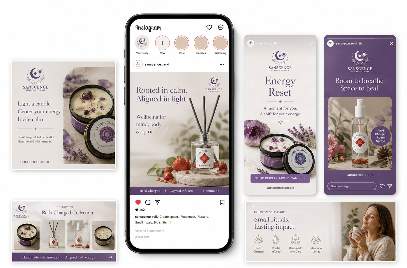
We developed the branding around a distinctive purple palette, consistent typography and a flexible approach to product packaging.
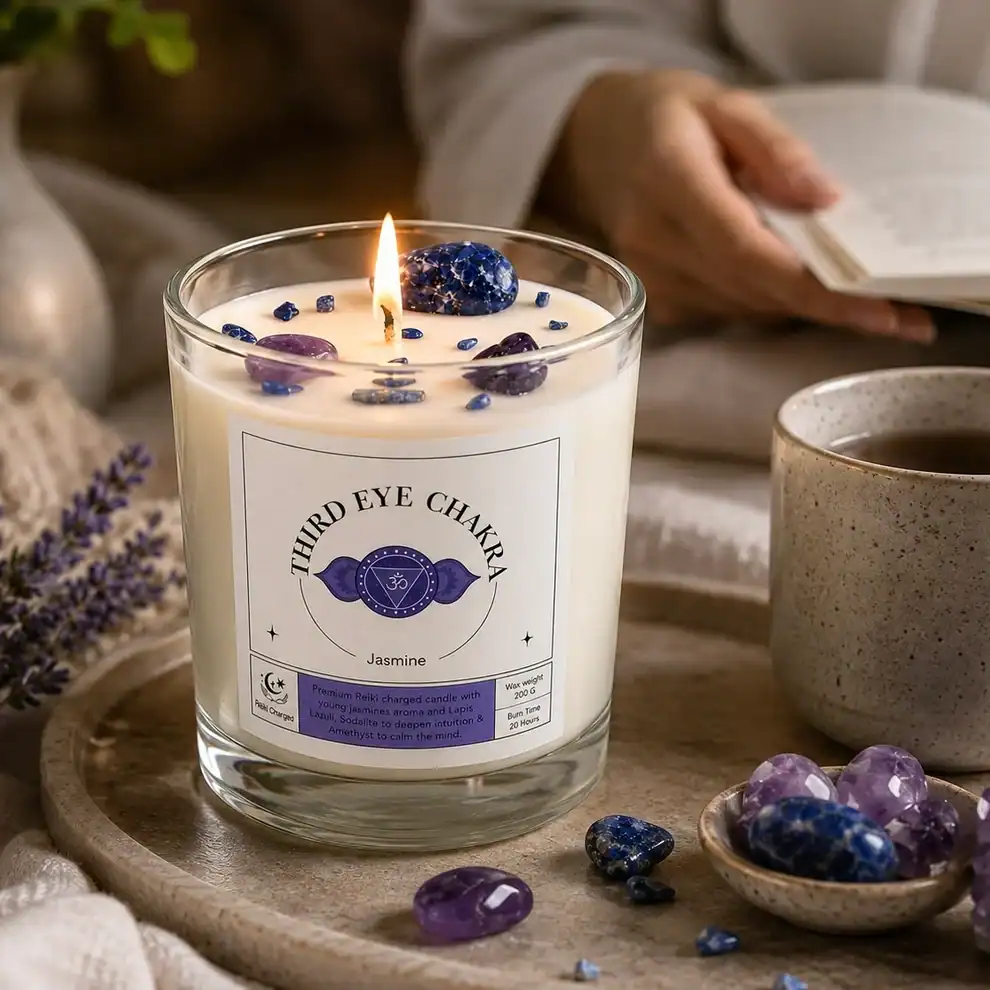
For the chakra candle collection, we created a shared label system that gives each product its own colour and symbol while keeping the wider range recognisable.
This approach meant new products could be introduced without having to rethink the packaging each time, while ensuring everything felt like part of the same brand.
Brand identity · Candle packaging · Branded print materials